Ziina QR Payments Product Page (Fintech, B2B)
Part of a wider consultancy project for Ziina’s Business Hub, this landing page introduced their QR Payments feature to small biz owners in the UAE.
Project Overview
Part of a wider consultancy project for Ziina’s Business Hub, this landing page introduced their QR Payments feature to small biz owners in the UAE. For the copy itself, I dug into user interviews, complaints, SEO strategy, product limitations, and UX structure to make sure the user journey is seamless. Every word was chosen to reduce friction, build trust, and help users go “ah, okay, this makes sense.” The team loved the work and the page became a template for future product pages.
The Details
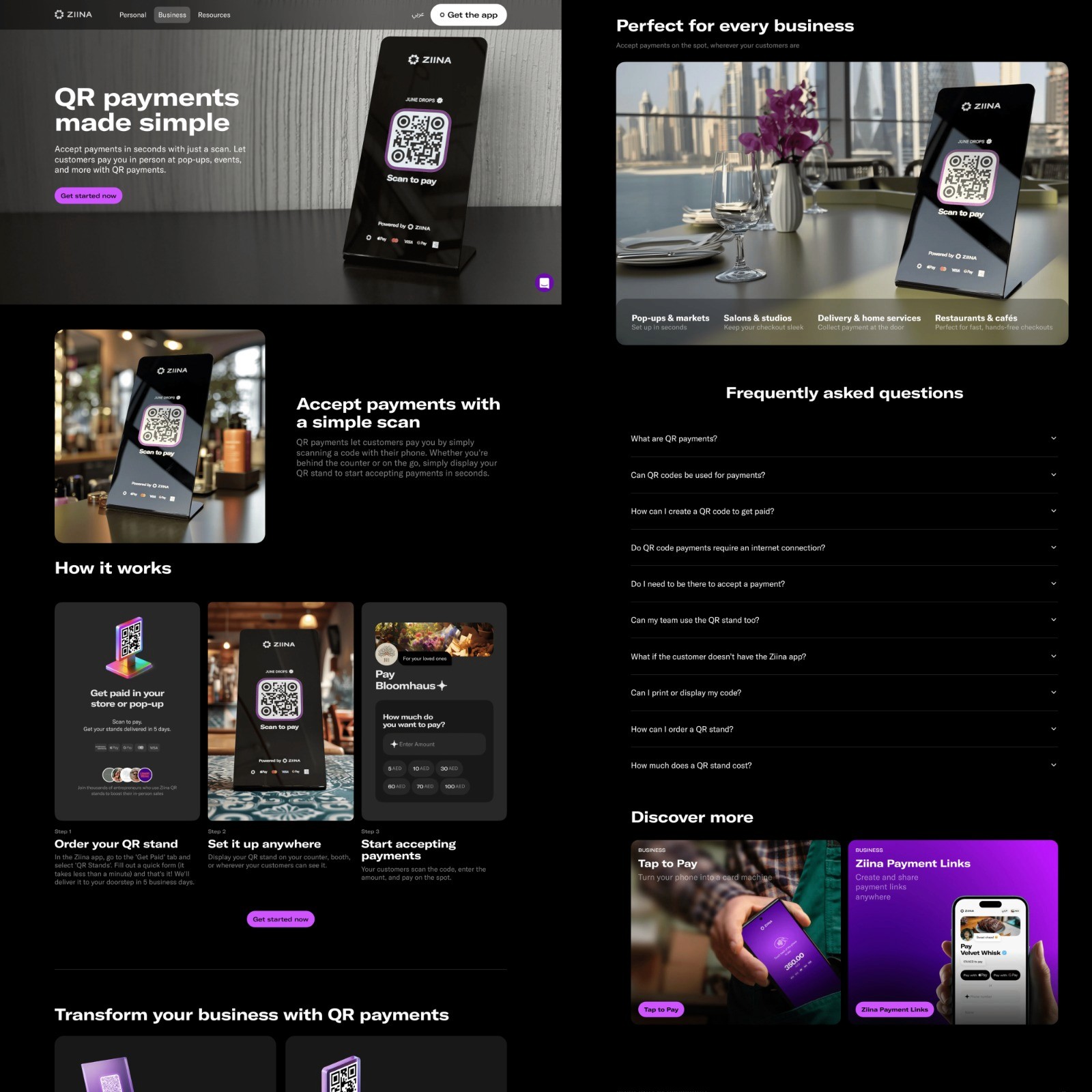
Ziina (a YC-backed fintech app based in the UAE) needed a clear, fast-loading landing page to introduce their new QR Payments feature. Their target audience was small business owners who are busy, skeptical, and not very tech-savvy.
The goal was simple: create a benefit-led product page that made it quick and easy to understand the feature and trust it.
Things I did before I started writing:
Talked to:
↠ The product team to clarify exactly what the QR feature did (and didn’t do)
↠ The customer support team to gather real questions, misunderstandings, and friction points from actual users
↠ The design team to understand wireframe logic and see if this page needed a slightly different flow
↠ The SEO team to balance clarity with searchability (keywords like “QR code payments” and “contactless payment for businesses”)
Also:
↠ Took the Ziina tone + brand guidelines, mixed it in water like a peach iced tea sachet, and chugged that big boy
↠ Stalked competitor pages to see how they were pitching similar tools… and where their user journey fell flat
Every section of the page was built on a simple psychology: Don’t make users think.
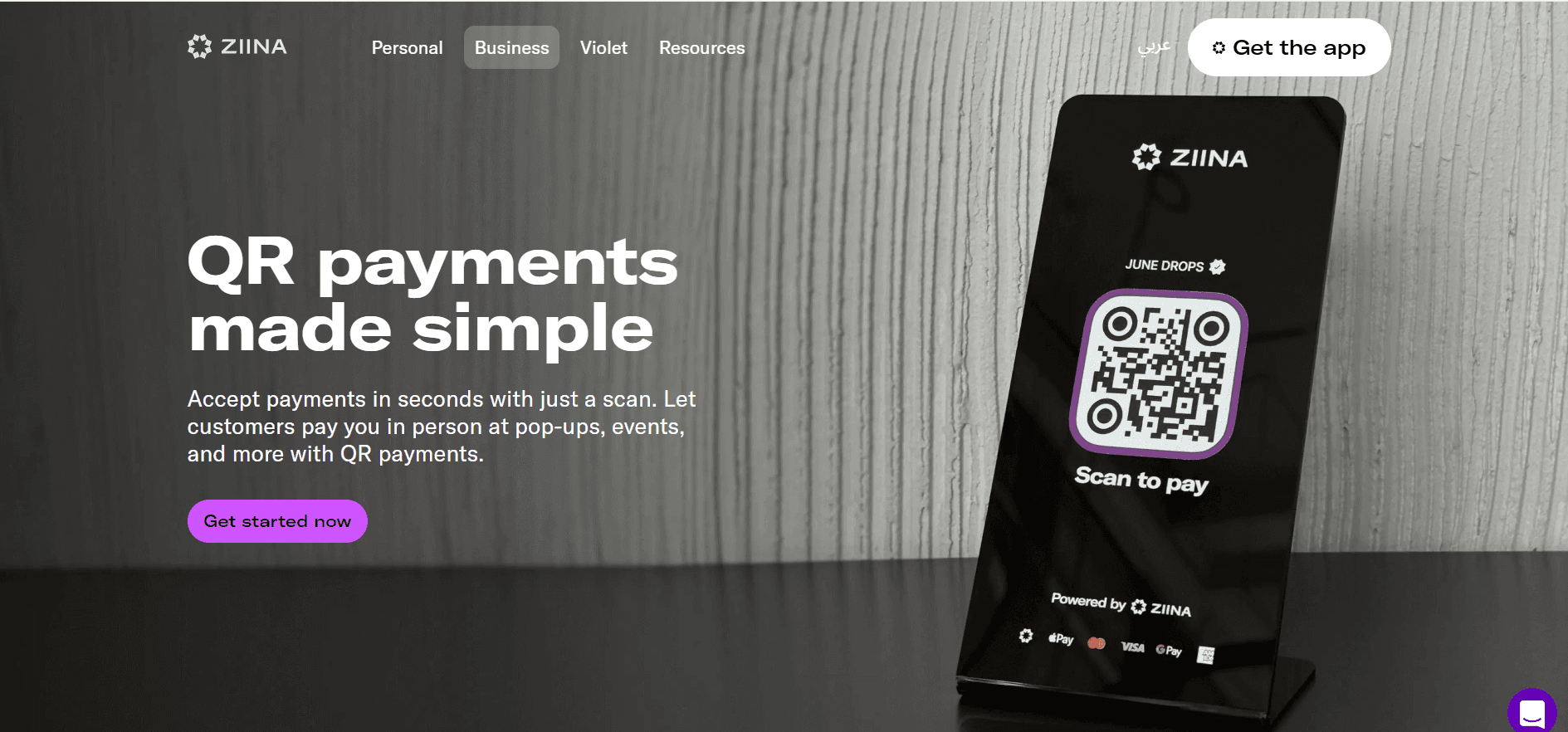
↠ Headline led with payoff + use-case versatility:
QR payments made simple
Accept payments in seconds with just a scan. Let customers pay you in person at pop-ups, events, and more.
↠ ‘How it works’ removed mental friction. The process was made feelable, like: oh, okay, I get it.
↠ Benefits section painted a world where they weren’t suffering anymore.
The language came straight from user interviews, customer complaints, and support tickets to soothe pain points before they were even voiced.
↠ The FAQs too were built on real, recurring questions from live support logs — rewritten in the chill, reassuring Ziina tone. I also used this section to sneak in internal links to related pages.
↠ The CTAs (in true Ziina fashion) were clear and simple to reduce hesitation:
Try QR Payments
Get started now
Get the app
The page went live as part of Ziina's merchant acquisition sprint and became one of the most visited in the Business hub. It also became the template for other product landing pages (which I later worked on too).