Website Copy for Fifth Dimension (Creative Strategy Agency)
Copy for a simple site that would act as a conversion tool for warm leads (most of his clients come in through Upwork + LinkedIn) for his creatives marketing agency
Project Overview
Farooq made it pretty clear that he was super tired of flashy webpages that looked great and said a tonne, but left the reader feeling confused and stupid. He wanted a simple site that would act as a conversion tool for warm leads (most of his clients come in through Upwork + LinkedIn).
The brief:
a. Don’t make the leads feel dumb.
b. Don’t drown them in marketing jargon.
c. Make them instantly get what he’s selling.
d. Do not make it sound like a flashy does it all agency.
We started with a simple question: what would this sound like if it were a person? And built the rest from there.
The Details
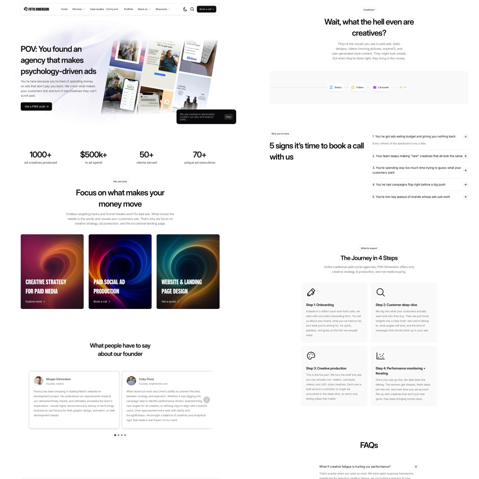
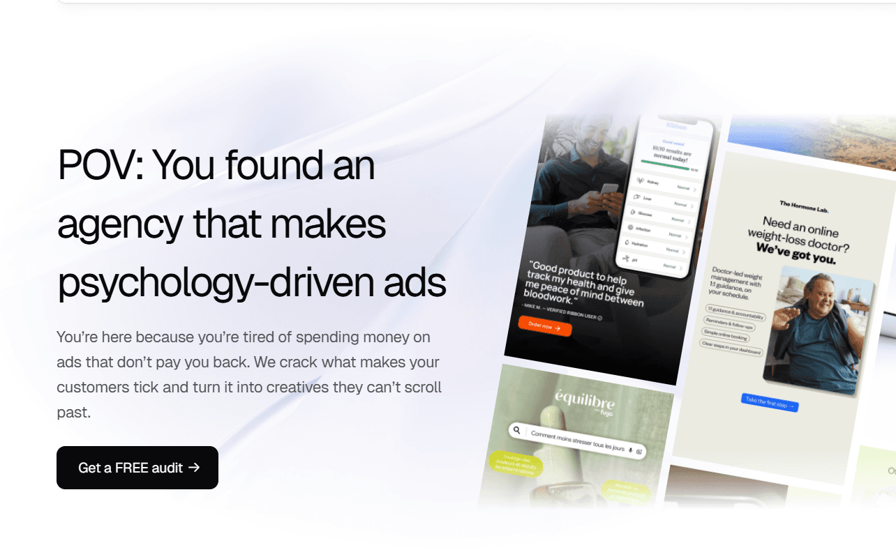
The goal was to help a creative strategy agency (that makes ads people actually watch) look, sound, and feel like the kind of team smart founders want to work with.
First: What we absolutely did not want:
1. Buzzword soup.
No “we’re a full-stack growth solution helping brands scale through authentic storytelling.”
2. Corporate LinkedIn-speak
No sterile case studies that read like quarterly reports or performance reviews.
3. Do-everything energy
No “we do it all” service list that makes you wonder what they actually do.
4. Vending machine vibes
The work isn’t transactional, so the website shouldn’t feel like it is either.
Then: What we did want
1. Copy that reads like a voice you can hear in your head.
One that’s smart, sharp, funny when it needs to be. Because if the site can’t hold attention, why should anyone believe the ads will?
2. Language that makes the reader feel clever for getting it.
3. A structure that sells through relatability
The whole site is a walk-through of what it’s like to work with Fifth Dimension. From “what happens after you book a call” to the very real decision-point of “should we break brand guidelines for performance?”
A few aha moments (aka: this is where it got juicy)
↠ People don’t buy “digitization.”
They buy security. Nostalgia. Comfort. That realization flipped the entire framing of one case study — and led to a creative that pulled $135k in spend with a stable CPA.
↠ “Creative strategy” shouldn’t mean vague vibes.
The site walks through how they think, instead of just what they do.
↠ The creative credit system (1 credit = static, 2 = gif, 3 = video) made pricing feel tangible
↠ 90-day minimum clearly signaled that this isn’t a one-off shop. It’s for people who actually want to test, iterate, win.
↠ “5 signs it’s time to book a call” — lifted straight from sales calls with founders
The Results:
Calls booked from the right clients, with 30% of all calls booked converted.
The CEO of a Pakistani fintech giant reached out to him because he loved the bit about psychology driven ads on the website